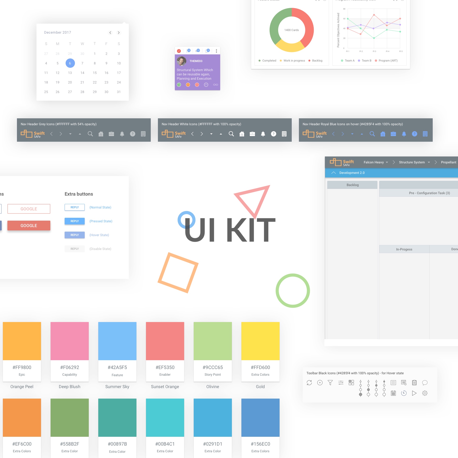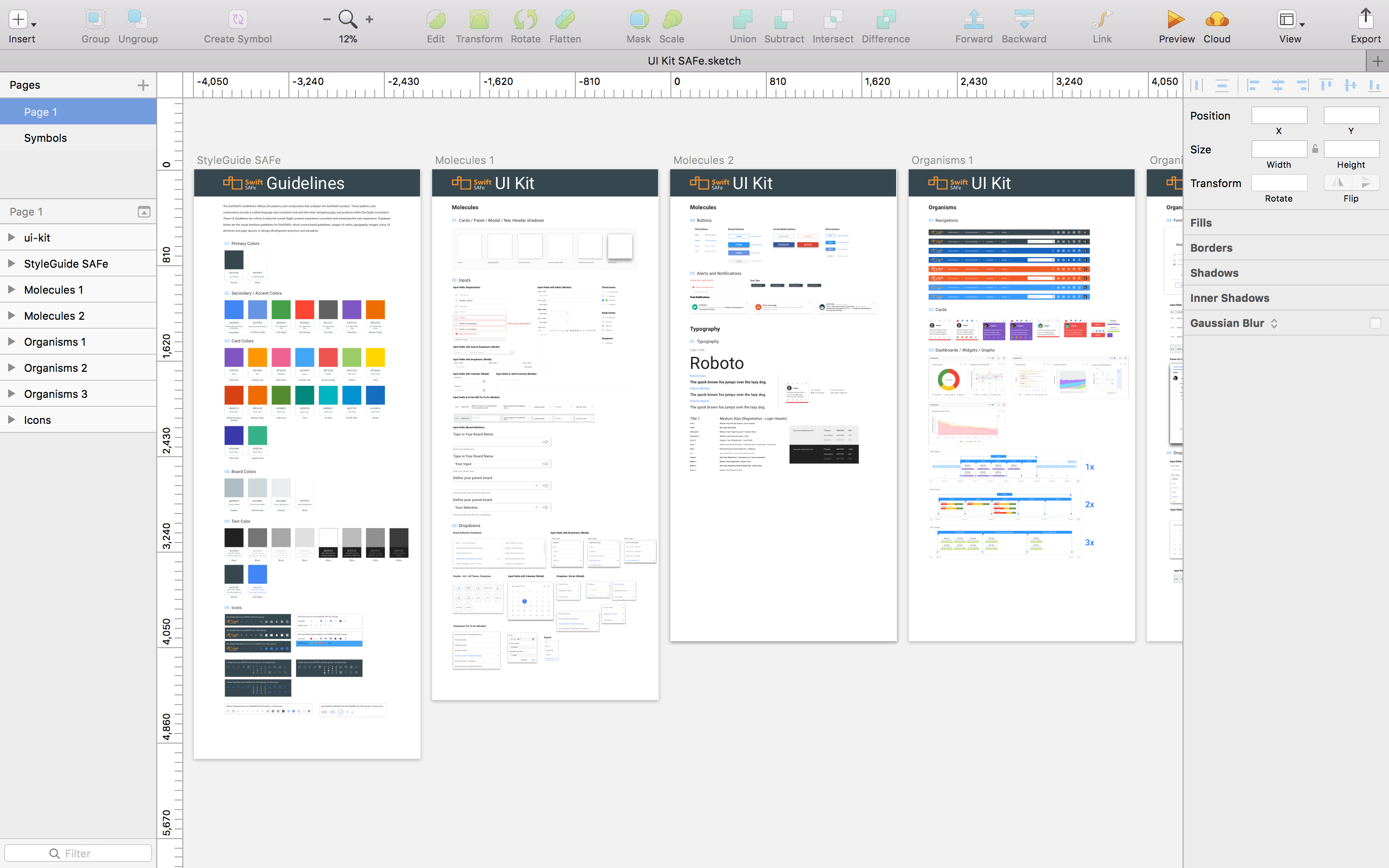
Well, there are many different approaches of doing your UI kit and many types of UI kits. I recommend you to pick something easy for a start. It means to pick an app topic that you are familiar with, then it will be fun for you. Work on it as it is a normal app, e.g. UX, Wireframes, Designs, Testing, etc. In this way you are gonna learn more about how to create an app from scratch. We carried this excercise out for our product.
Consistency is the key to create an usable UI kit. Everything needs to be consistent, especially icons, elements that repeat a lot, this will challenge you, and you will learn a lot but it is worth it. Consistency principle also applies to your life.
After creating an app you will only have to convert it to symbols. Well, you are not near the end, now you need to sit tight and learn how to use the symbols properly or build it as a pro if you are already experienced. But for those who are not experienced there are some really nicely done articles online.

I recommend you to study how to build the design system, the best practice is to download some already done system, for example from Jan Losert, who did really great work on his latest system. Download it, try to understand how it works and you’ll see. This is the fastest way to learn how it works. After you start creating symbols you may realize that you are doing it in a wrong way, which is not necessarily bad, this is just a part of the learning process. So when it happens open a new file and start working on it again. I’ve did it several times. A good practice is to divide symbols in the categories, I’ve divided them into Resources, Elements and Screens.
Creating a UI kit will ease up your wokrflow and everything will start looking consistent and reusable. Over time you can always adapt and make your own design language for your app or a product.